Fresh Start
For as long as I can remember, I've been a winter person, shunning all heat, content with the grey skies over sunny ones, but after this particularly rough winter (by PNW standards), I am so ready for spring. SO. READY.
Luckily, Ali Edwards' March digital kit showed up for me just in time. On a particularly glum day I dove into the kit and made two simple, but story heavy layouts in about an hour, and it was so, so good for the head and heart.
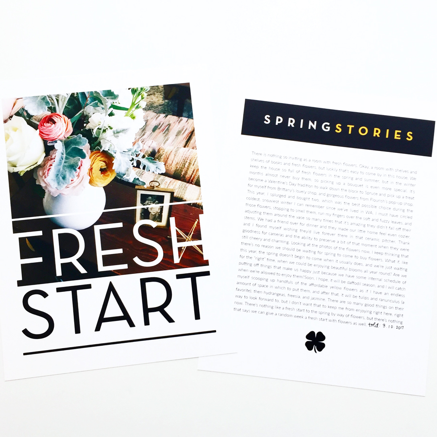
For the first one, I knew I wanted to tell the story about fresh flowers in our home, and I was dying to use a photo I snapped of the bouquet I bought myself as part of my Valentine's tradition. I wanted to make it the focal point, but I also wanted to write quite a bit, so a two page spread was perfect!
I used the digital "fresh start" stamp to give the photo a little more presence and title on the left page. In order for the first word to be white, and the second to be black, I did a simple digital step that I learned this last year, and because I know that there must be more of you like me who are learning as you go with these programs, I wanted to share a simple video about how I brought together the digital elements of this hybird page, and you can watch it here:
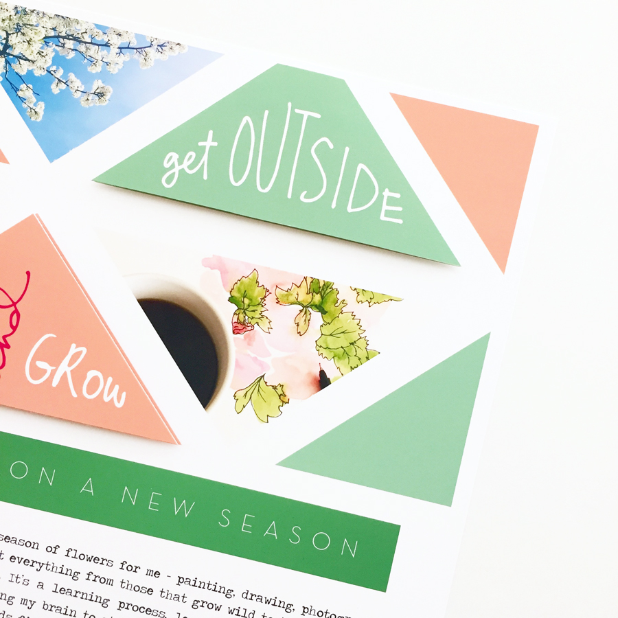
For the next layout, I wanted to use more of the awesome colors from the kit (green is absolutely tugging on my heart strings lately). The triangle in the kit are perfection, and just what I'd been looking for to use to build my own pattern on a page. Because the focus of this layout is more about the story than the photos, I used the clipping mask technique to format a couple of images as triangles to help illustrate the story, making them less of the focal point, which I love sometimes.
I LOVE hybrid pages because you can make a simple page that you can print out and love as-is, or you can add an easy physical embellishment and really make it pop. For this layout, I printed out doubles of some of the triangles, cut them out, and adhered them on top of the page with adhesive foam dots to give them a little lift, and to draw the eye to some of my favorites. So simple, but it can make such a difference to the final look. Plus, my motto seems to be "pop dots forever" so it's really no surprise they're there.
Just in case you haven't used a clipping mask before, or want to see how I put together the digital portion of this layout, here's a quick video walkthrough of how I was able to pull these pieces together:


